Tuesday, 10 November 2015

Semiotics

I will be using the idea of semiotics to deconstruct media texts as a form of primary research. The media texts I will be examining will be the record covers I choose to case study, by the following designers; Barney Bubbles, Andy Warhol, Peter Saville & Malcolm Garrett. The reason I will be deconstructing these media texts is to find out and elaborate on the post modern elements of the media texts.

Semiotics works on a signs and signifers basis. A sign is something that is to be taken at face value; what the thing is to put it bluntly. to prove a simple understanding of this concept I will deconstruct various elemnts of the Arctic Monkeys album cover. Take the example of a cigarette in this image as the sign. Now a signifier is what that element signifies/implies. Taking the cigarette elemnt of this album cover it could be so that he looks cool, he might be doing it because he likes smoking & maybe beyond that to show addiction.


Tuesday, 3 November 2015

Teach Yourself Post Modernism

Post Modernism is to becoming part of the everyday.

Film references are popping up in beer commerical in a spoof of art types and advertisers are confident that the target audience will get the references. (here's an interesting idea; Is it still post modern if the thing that it is parodying falls on deaf ears, if the audience does not get the reference).
The idea of post modernism has been adopted by every discipline; art to architecture/literature to theatre. evidence that it is not meaningless, if it has been adopted by so many professions.

It is accepted in this book that post modernism is a broad church of meaning and it's meaning has changed overtime. New meanings develop as the society changes. The book proclaims it is an artistic style, a state of affairs in society and the rules that govern these affairs. The new post modern rules; propose that the culture we are in, has changed greatly in 100 years. The new post modernism is concerned with concrete subjects. The new post modernism believes in the abstracted definition of identity and reality.

Post modernists stuck to these thoughts came up with huge and splashy ideas, subscribing to the pluralist idea, that anything goes. Anything from the past is open to interpretation, old styles and techniques were rehashed with artists quoting from other artists. (John Savage, proclaimed in the age of plunder, this diluted the artist medium, it sometimes ends up being a poor imitation of the former credible source material). But some sources claim it to be playful and entertaining.

What does it all boil down too? Are the ideas a betrayal, a rejection or just outright ignoring modernism? (Barney Bubbles didn't, some his work references the modernist structure).

Thursday, 22 October 2015

Context, It's all about context

Context, It's all about context. Leading on from my last post dicussing design as art, I had a discussion about why Central Station Design, one of the most innovative factory designers could not be considered art. Despite them being labeled so in the credits of the album cover for Pills, Thrills and Bellyaches. Referencing the fact that Andy Warhol, designed record sleeves but was also an artist. It was found to be all about context. It is art because it is in a gallery and it is not art because it is in record shops.

however, linking to my theme of post modernism, it is about changing context. Post Modern designers repurposed the great and good of years of visual history for their projects. Famous examples that I have mentioned before include;
  • the icon from a dada magazine into a 7 inch single cover for New Order.
  • a fruit in the fruit bowl becomes a suggestive icon on the the Velvet Underground and Nico album.
  • a still life painting becomes a juxtaposition to pioneering electronic music by New Order.
  • a scientific diagram becomes a logo for the band Joy Division.
  • taking an explict collage to put on a 7inch single by Buzzcocks
So if we are still post modern as a society, record covers shoud be considered art and there is evidence all around to show that this is being done. Secret 7's shows all of sleeve designs in a gallery prior to sale. Revolutions: From Gatefold to Download, the Art of the Album Cover was held in 2009, covering all of the importnat designers and designs. Its not just a collection designers that get exhibitions Storm Thorgerson was given a show at the Idea Generation Gallery after his death as a tribute to his work.

Tuesday, 20 October 2015

Art by Central Station

Factory Records, a company who blurred the balance between art and design during the early years finally expressing the true intention with this credit printed on the inner sleeve of the Happy Monday's album "Pills, Thrills and Bellyaches". The front cover, see below, all about consumerist America and it's confectionery packaging.

In many ways not to call this art and label Andy Warhol art would not be fair. Both creators are work in different ways to achieve the same desired effect. Bright colours, satirical tone & bold. Just one is lauded and hung up in galleries in, the other is mostly forgetten unless you liked the album.


Artist Record Works

Record sleeeves form a sub history of art. 12 inch album covers offer a large canvas on which to work. So it became an site of invention.

Sticky Fingers by The Rolling Stones; included a real working zipper on the front cover.

Velvet Underground and Nico had an peelable bannana on the front cover disguising a provocatively coloured pink.
The first pressing of The Who's Live at Leeds had 12 different inserts included.

Make Music Visible

The music industry went into a downward spiral. Hastyly downsizing to fit the digital revolution.
"How do you design a definable image that at one point is the size of a postage stamp and the next it's the size of a facing house?"


Music design is the process of Creating something with a bit more love and care giving the sense of added value for money.

Alex Steinwiess

"the way they were selling these albums was ridiculous. The covers were just brown, tan or green paper...there's no push to it. There's no attractiveness. There's no sales appeal."
Alex started to design covers for records in 1938 for columbia records. They featured no portraits, just musical and cultural symbols with strong central images, eye catching lettering and distinctive colour combinations.

Monday, 12 October 2015

Out of the Blue


Use hearing protection was an industrial design the Saville repurposed for this the first Fac item. In 1979: the audience of music was aware, of course, of distinctive sleeve design. Previous marriages between sound and images have been lauded. Blue Note and Dark Side The Moon, to name but two. Few people thought that Graphic Design was an expansive medium. The New Musical Express (NME) was a popular and influential paper but was just waiting for The Face for a style upgrade.

The Lack of information (on Unknown pleasures) cover makes it distinguishable. Punk Rock designers had unhinged ideas, they showed the links behind Consumerism & advertising. Jamie Reid, was critical, talking about consumerism in the journalistic tradition of art & mass media. [see holiday in the sun.]

Unknown Pleasures

Unknown pleasures cover would probably have been rejected by a major record company. Hierarchies would have not allowed designers to explore the curious, the relationship with the sound production. Consider it; tactile paper stock, no band name or title (not even the Beatles got away with that), a luxurious black, making it look expensive. Saville comapres the pulsar CP1919 to be the equivalent to the rolling stones tongue. It became the brand of Joy Division. Rip off T shirts etc can be found on market stalls across the world. The intention of was for it to be a thing like a 70's dieter rams product.  

Garrett, Saville & Brody are the key figures around this time responsible for raising the profile of graphic design.

Monday, 5 October 2015

Post Modern but not Especially Proud of it

The design was kitch, colourful, avant garde (not the typeface) & elaborate.  The style of post modernism was sort of an early warning system for the lives we lead now. Jamie Pavitt; "there is much resonance with  what we have experienced: collapse of the economy, crisis in avant garde & what it means to be progressive."

Does it (post Modernism) exist at all, and if so what does it mean? Is it a concept, practise,a matter of local style or a whole new period or economic phase? SO few people identify with post modernism positively because it is so easy for post modernism to look tacky. "I never understood why post modernism had to define itself in the negative""to not say what it aspires to be but rather what it is not"


Monday, 7 September 2015

The A to Z of PoMo (selected relevant highlights)

Capitalism: Shiny post modern products were churned out to supply the demand of the money to burn consumers. Function became less important that the "boom times". Post Modern signifier; an object which is sleek & stylish to do a mundane job.
three-legged lemon squeezer, by the French designer Philippe Starck
Graphics: challenged established rules of design, Neville Brody via The Face, made dramatic new layouts the norm.

Las Vegas: Different styles. Style over substance; hotels made to look Rome, Paris & New York.

New Order: (Power, Corruption & Lies) Juxtaposition of electronic music and still life painting.

Outrage: Gender Bending antics of Stephen Strange/Boy George. The excess of the lifestyle.

Zoo Records: Post Modern Rockbands - Echo & the Bunnymen & Teardrop Explodes

> Bill Drummond, while drawing attention to the void at the heart of post modernism, raises a burning question; "if attacking post modernism is also post modern, can the movement ever end?"

From Neon to New Order

Postmodernism is define by it's fragmentation or out right refusal of narrative. The Las vegas Strip does not follow a single narrative, it is a time machine, a clash of cultures from french landmarks, Egyptian pyramids, Italian architecture. Some would deem all of this to be kitsch and superficial and there is no doubt it's post modern.

The idea of style holds the idea of post modernism together, some go as far as to say that it beyond style. It is a pluralist theory too suggesting that there is not one universal style that defines itself, it means multiple things to multiple people. An idea deeply critical of the past was turned on it's head in 1978, when Kraftwerk, became critical of the future. With their "robot" selves, they predicted that we would all become like robots, stylized and cultivate. It was presented in such a way, that their were distopian undertones to it, suggesting you will be like this one day.
Cindy Sherman, the photographer, rejected the fixed narrative of gender and heterosexuality in photography by being the central focus of all her photographs, dressing up as men, women, children. Unfixing individuality and cultural permissiveness. The effects of post modernism are still being felt in today's culture. So it can be accepted, like it or not, we are all post modern.


Thursday, 3 September 2015

Postmodernism: Style & Subversion, 1970-1990

It was a dramatic change in direction for the art world; and by the early 1970's it had "arrived". As a movement that was revolutionary, irreverent and stylistically rehashing of the old. It dismantled boundaries, between high and low culture, thus removing art's superiority. Art was no longer an elitist profession, low culture could begin to enjoy art as it meant something to them.

In the 80's, Andy Warhol painted dollar signs, alluding to arts capitalist ways. It was still an expensive game. Peter Saville, took art from the canvas to the record covers by using 19th century art and contextualizing for the music industry. "Pop Culture used to be like LSD; different, eye opening & reasonably dangerous" Saville said "the things that pop music was there to do for us, have all been done.." He proclaims that "Andy Warhol illustration on a Velvet Underground album was a revelation.

What will history make of postmodernism? Is it style over substance? is it style without substance? "Art is whatever you can get away with" Warhol proclaimed.

http://www.anothermag.com/art-photography/1472/postmodernism-style-subversion-1970-1990

Tony Wilson : The Postmodern Mythmaker by Adrian Shaughnessy

Shrewd patron of Graphic Design. A man who signed the first wave of post modern popstars - Joy Division, New Order, Happy Mondays, Durtti Column, and others - are name checked in the article. Asked why he thought design was important he is quote as saying; "why was music packaging important to us? because the job was a sacred one.. does the catholic church pour wine into moldy earthenware pots? I think not."

On the subject of meeting Peter Saville, the designer at Factory records for its pivitol early years, said He showed him "a book on Jan Tschichold. He showed him the Penguin Crime covers from 1941, the constructivist play posters from the 1920s and the cover of the 1965 Hoffmann-Laroche catalogue."

http://www.designobserver.org/article.php?id=5817

Design in a Nutshell

Modernism: Less is more.
Post Modernism: less is a bore.
Cultural references.
More than one appraoch.
Challenging.
Recycling the past.
Mass Media.
Liberating.
Quirky.
Political.
Creative

www.youtube.com/watch?v=lKomOqYU4Mw

Indiapolis Musem of Art, Design as Art: Post Modernism

Design history is subjective. It is driven by personal opinion. Not objective like the modernists once thought. In today's world, look at old and new design with the same subjective views where as they used to be separated. The 19th century was the start of all design as we know it, so we have a wealth of history to look over.

Post modernism was the "new" trend in the 1980's. Its effected images, ideas,messages, stories & emotions. It can be defined as a combination of styles, design for decoration. It is all about context; you can take an existing product, make minor changes to it and change it's purpose, therefore it has to be seen in a different context. Consumer's Rest' chair, 1983, Siegel, Günzburg, is sighted in the lecture. 


Post modernism blurred the lines between art and design. The idea that art is done by artists and design is done by designers, is no longer relevant. You can design a piece of art and re purpose a piece of art into a design. Design is the new art, as art collectors are buying design. Appearance is dominant but you need judge them in the same way you would any piece; intellectually, who was this designed/done for? why is it the way it is? 

 to paraphrase the speaker, Dr. Josef Strasser, "without knowledge of the past, how can we look at tthe present, let alone the future. Looking at design past, saves us from wrongly judging the present." 

Pop: the begining of post modernity.

Pop art was the beginnings of post modernism. It was the first major movement to look back. In terms of Liechtenstein; he in particular looked back to the vintage comics of his childhood and paid homage to them by blowing up scenes from the comics and painting them on large scale canvases. In Ray Johnson's work, took photographic references of old popular figures and included them in his collages, all of this years before Warhol celebrity based work. Then there is Andy himself, who used celebrities as well as popular branded products in his multimedia works. James Rosenquist; another americain pop artist, took his call mainly from US billboards showing the American dream and juxtapose them with the reality of living in the USA.


In Britain, Peter Blake & Richard Hamilton were also post modern in their approach, often credited with being the first piece of pop art with Just what is it that makes today's homes so different, so appealing?, takes from american culture, not via a homage but taking clippings and cuts from the media of the time. Blake did this this too with images of Elvis, Ricky Nelson and Frankie Avalon, as well as a vinyl record.


The main things that makes these pieces post modern is the idea of the fusion or blurring  of low and high culture. Prior to these pieces/artists, art was considered for the upper classes, snobs if you will. But inclusion or just references of pop figures and consumerist imagery, art could begin to speak to the masses. This is what is known as intertextuality. References will always be made this things gone before are common place, everything is a copy of a copy. True originality, there is no such thing. Even though it was frowned upon at the time for being subversive or just offense to the old guard of artists. It has penetrated popular thought and now as a style it is a given.

Wednesday, 26 August 2015

Sign of the Times: Music and Design, 1960s-1980s - Cooper Hewitt design lecture.

Cooper–Hewitt, Smithsonian Design Museum, is one of the most respected design museum's housing some of the most important pieces of design history. It regularly posts videos of design lectures held in New York and this one seemed relevant to where I want to go with my dissertation.  Below are a type up of my notes from said lecture.

Art, Design, Music & Pop Culture have always had a crossover. Members of The Rolling Stones, The Beatles and The Who all went to Art college. Charlie Watts before the band even started in 1955 was a graphic designer by trade. One of the first designers that these art students would of been interested in was Saul Bass. His title sequences were essentially abstract art set to music.


Going back a little further in the late 40's/early 50's, modernism was banned or rejected by music, the fashion of the teddy boys was Edwardian in style. This in the late 50's this all changed with the influence of pop art. Former teddy boys, the Beatles took pop art to a whole new level with Sgt Pepper's Lonely Hearts Club band. A £3000 album cover that put Sir Peter Blake in the public consciousness. A regular album at the time on average cost around £50. Another big pop art & more importantly Post modern album cover is the debut by the work of the Velvet Underground & Nico. The front cover is a banana against a white background and signed by Andy Warhol. It took the vernacular (the everyday) and appropriated it to give it a different meaning.


Milton Glaser's, the founder of Push Pin, famous poster for Bob Dylan's Greatest hits we may think is a psychedelic masterpiece but it directly references the style of art nouveau a style famous from 1890 until the First World War. Psychedelic posters at the time were all very reminiscent of Art Nouveau. Victorian imagery, curvilinear calligraphy & finesse all very characteristic.


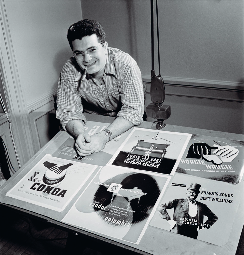
Designs done by Paula Scher appropriated design styles dependent on theme per LP for her design career at CBS records. With a hatred of Helvetica, use of a swiss style was unlikely to be adopted. Hand lettering, finesse and constructivism, anything but helvetica. Borrowed from the past is the way she describes it in her part of the lecture.


the last speaker spoke on the subject of Punk Rock and praised the anyone can do it attitude. Despite it being different in tone across the globe, there is a universal style in the fanzines that followed each of the scenes; cheap & anti professionalism, despite the methods of communication that they used being nothing new. Collage, the main theme throughout the fanzines, had been around for a long time prior to the birth of punk. An explanation that designing for punks signed to major labels would be harder; making an anti establishment design for a corporate product.


https://www.youtube.com/watch?v=OSasiEgUSy4

Tuesday, 25 August 2015

Peter Saville

I am trying to view this without a a sense of bias as he is one of the very reasons that I am in the field of Graphic Design. His anthology of design for Factory Records was my bible prior to coming to uni.

Peter Saville is a graphic designer from Manchester. Even from his outset his ideals of post modernism were highly evident. His first piece for The Factory - re-appropriated a warning sign on a building site to a gig poster. Later on in his work for Joy division, he contextualized a science diagram for one of the most iconic albums of the punk era. New Order was the band, he did the most work for and a lot of that work has since been discovered to be re-appropriated. He has made no secret about this; "Better to quote... than to Parody ...it is more honest, more intellectual" from No More Rules: graphic design + post modernism.

On the left hand side is the original material, pre-appropriation by Peter Saville and on the right is the LP/Record cover.


Tuesday, 4 August 2015

Postmodernity vs. the Postmodern vs. Postmodernism

Georgetown university, in Washington DC has online faculty page on "Po-Mo". It discusses Postmodernity, the Postmodern & Postmodernism in sections. It approaches different aspects of all of these from many different angles.

It defines Post Modernism, as a mix of low (pop) and high culture. The Pop culture element comes from what the majority of the population enjoy (Pop music, the Sun, take away meals) and the high culture comes from what the top percent of the population enjoy (Classical music, Financial times & michelin star restaurants). It tells that designers, at the time, took the decision to reject the modernist values and it's master narrative ideas.
It was a remix trend. It took existing material and re-purposed it; old photos of the stars (seen as low culture) were given a new colour scheme and hung on the gallery wall (high Culture).  Whaam by Roy Lichtenstein references directly action comics of the 1950s (low Culture) and turn it into art (High Culture).


Directly linked to this remix idea, is connected to the idea that the history is not the authority of the current, more a source in order to pastiche, collage and parody. It's purpose; nostalgic or otherwise. In the 21st century, it is a given that everything is post modern & the influence of all of the current trends are already mixed sources, thus making everything and anything post modern.

V&A

in 2012, the victoria and albert musem did an exhibition on post modernism entitled; Postmodernism: Style & Subversion 1970–1990. It explored what they determined to be the cream of the crop of post modern design in a lot of fields but sadly missed out Graphic Design. However reading the exhibition preface it has some useful explanations of the terminology and themes behind the movement.

As a movement it shattered the ideas of the past throwing away the conventional and exaggerated on it. To make it more then just a functional piece of design. It was a piece that actually had style, a statement piece.

Martine Bedin (for Memphis), Super lamp prototype, 1981. Painted metal with lighting components. V&A: M.1-2011
Post modernism was often controversial, and sometimes over stepped the line of taste.  Even sometimes being so obvious and so self congratulating that it is visually painful.Being self aware of the design decisions that they are making was used to create a sense of irony. This irony and self congratulation became very unstable as it would get very tiresome.

A theme of a lot of post modern is exaggeration. in size, in colours & done sometimes for parody. Now below you can see Mr David Byrne (of Talking Heads fame(left)) in the famous Stop Making Sense suit. It is seen my many to be a  big piece of post modern design because it is exaggerated in size and may very well of been a parody of the 9 to 5 office workers outfit. Grace Jones' dress on the right is also considered a masterpiece of post modern design; it is big, bright and comedic in it's sheer styling. It ticks all of the boxes and is self aware it is doing all of these things.

The ever successful rise of post modernism would lead to its decline. It started as a design revolution mainly over the early 1980's but by the end of the 80s it had become commercialized. It just crippled under the weight of it's own success. It can still be felt in the undertones of current design and it's subsequent trends.