Thursday, 22 October 2015

Context, It's all about context

Context, It's all about context. Leading on from my last post dicussing design as art, I had a discussion about why Central Station Design, one of the most innovative factory designers could not be considered art. Despite them being labeled so in the credits of the album cover for Pills, Thrills and Bellyaches. Referencing the fact that Andy Warhol, designed record sleeves but was also an artist. It was found to be all about context. It is art because it is in a gallery and it is not art because it is in record shops.

however, linking to my theme of post modernism, it is about changing context. Post Modern designers repurposed the great and good of years of visual history for their projects. Famous examples that I have mentioned before include;
  • the icon from a dada magazine into a 7 inch single cover for New Order.
  • a fruit in the fruit bowl becomes a suggestive icon on the the Velvet Underground and Nico album.
  • a still life painting becomes a juxtaposition to pioneering electronic music by New Order.
  • a scientific diagram becomes a logo for the band Joy Division.
  • taking an explict collage to put on a 7inch single by Buzzcocks
So if we are still post modern as a society, record covers shoud be considered art and there is evidence all around to show that this is being done. Secret 7's shows all of sleeve designs in a gallery prior to sale. Revolutions: From Gatefold to Download, the Art of the Album Cover was held in 2009, covering all of the importnat designers and designs. Its not just a collection designers that get exhibitions Storm Thorgerson was given a show at the Idea Generation Gallery after his death as a tribute to his work.

Tuesday, 20 October 2015

Art by Central Station

Factory Records, a company who blurred the balance between art and design during the early years finally expressing the true intention with this credit printed on the inner sleeve of the Happy Monday's album "Pills, Thrills and Bellyaches". The front cover, see below, all about consumerist America and it's confectionery packaging.

In many ways not to call this art and label Andy Warhol art would not be fair. Both creators are work in different ways to achieve the same desired effect. Bright colours, satirical tone & bold. Just one is lauded and hung up in galleries in, the other is mostly forgetten unless you liked the album.


Artist Record Works

Record sleeeves form a sub history of art. 12 inch album covers offer a large canvas on which to work. So it became an site of invention.

Sticky Fingers by The Rolling Stones; included a real working zipper on the front cover.

Velvet Underground and Nico had an peelable bannana on the front cover disguising a provocatively coloured pink.
The first pressing of The Who's Live at Leeds had 12 different inserts included.

Make Music Visible

The music industry went into a downward spiral. Hastyly downsizing to fit the digital revolution.
"How do you design a definable image that at one point is the size of a postage stamp and the next it's the size of a facing house?"


Music design is the process of Creating something with a bit more love and care giving the sense of added value for money.

Alex Steinwiess

"the way they were selling these albums was ridiculous. The covers were just brown, tan or green paper...there's no push to it. There's no attractiveness. There's no sales appeal."
Alex started to design covers for records in 1938 for columbia records. They featured no portraits, just musical and cultural symbols with strong central images, eye catching lettering and distinctive colour combinations.

Monday, 12 October 2015

Out of the Blue


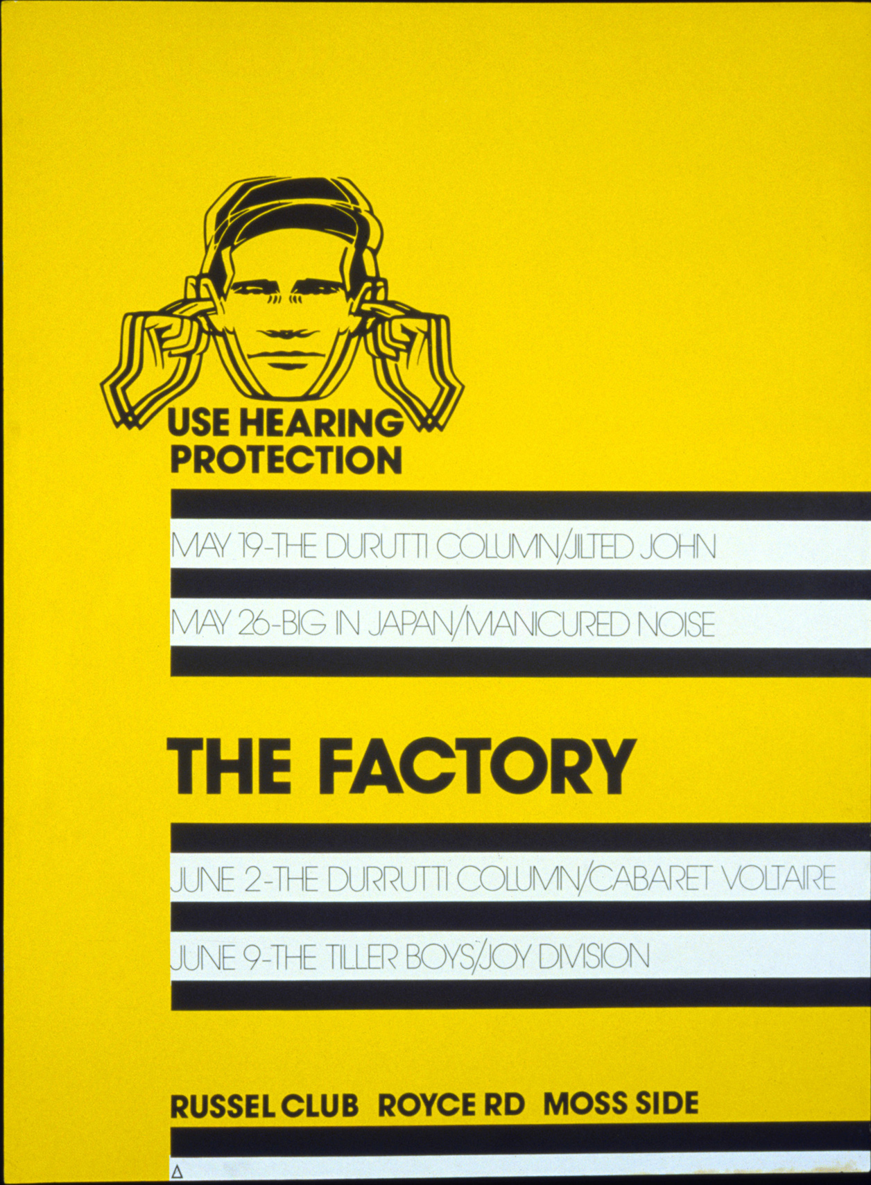
Use hearing protection was an industrial design the Saville repurposed for this the first Fac item. In 1979: the audience of music was aware, of course, of distinctive sleeve design. Previous marriages between sound and images have been lauded. Blue Note and Dark Side The Moon, to name but two. Few people thought that Graphic Design was an expansive medium. The New Musical Express (NME) was a popular and influential paper but was just waiting for The Face for a style upgrade.

The Lack of information (on Unknown pleasures) cover makes it distinguishable. Punk Rock designers had unhinged ideas, they showed the links behind Consumerism & advertising. Jamie Reid, was critical, talking about consumerism in the journalistic tradition of art & mass media. [see holiday in the sun.]

Unknown Pleasures

Unknown pleasures cover would probably have been rejected by a major record company. Hierarchies would have not allowed designers to explore the curious, the relationship with the sound production. Consider it; tactile paper stock, no band name or title (not even the Beatles got away with that), a luxurious black, making it look expensive. Saville comapres the pulsar CP1919 to be the equivalent to the rolling stones tongue. It became the brand of Joy Division. Rip off T shirts etc can be found on market stalls across the world. The intention of was for it to be a thing like a 70's dieter rams product.  

Garrett, Saville & Brody are the key figures around this time responsible for raising the profile of graphic design.

Monday, 5 October 2015

Post Modern but not Especially Proud of it

The design was kitch, colourful, avant garde (not the typeface) & elaborate.  The style of post modernism was sort of an early warning system for the lives we lead now. Jamie Pavitt; "there is much resonance with  what we have experienced: collapse of the economy, crisis in avant garde & what it means to be progressive."

Does it (post Modernism) exist at all, and if so what does it mean? Is it a concept, practise,a matter of local style or a whole new period or economic phase? SO few people identify with post modernism positively because it is so easy for post modernism to look tacky. "I never understood why post modernism had to define itself in the negative""to not say what it aspires to be but rather what it is not"